IT Services & Solutions
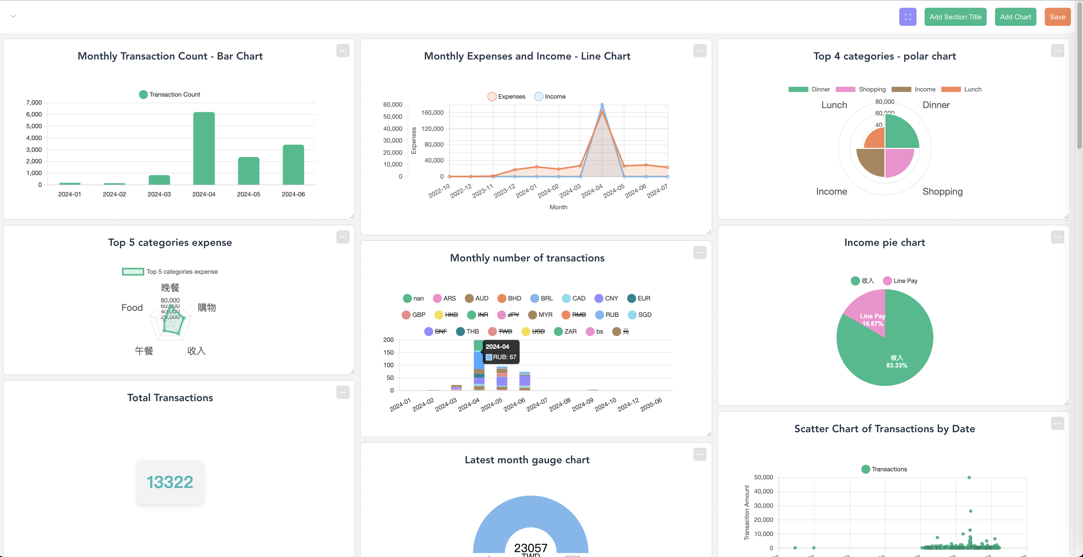
Appar AI dashboard generator
Start visualizing your data with AI right now! Create charts and dashboards online, no hallucination.
IT Services & Solutions
Start visualizing your data with AI right now! Create charts and dashboards online, no hallucination.
THE PRODUCT
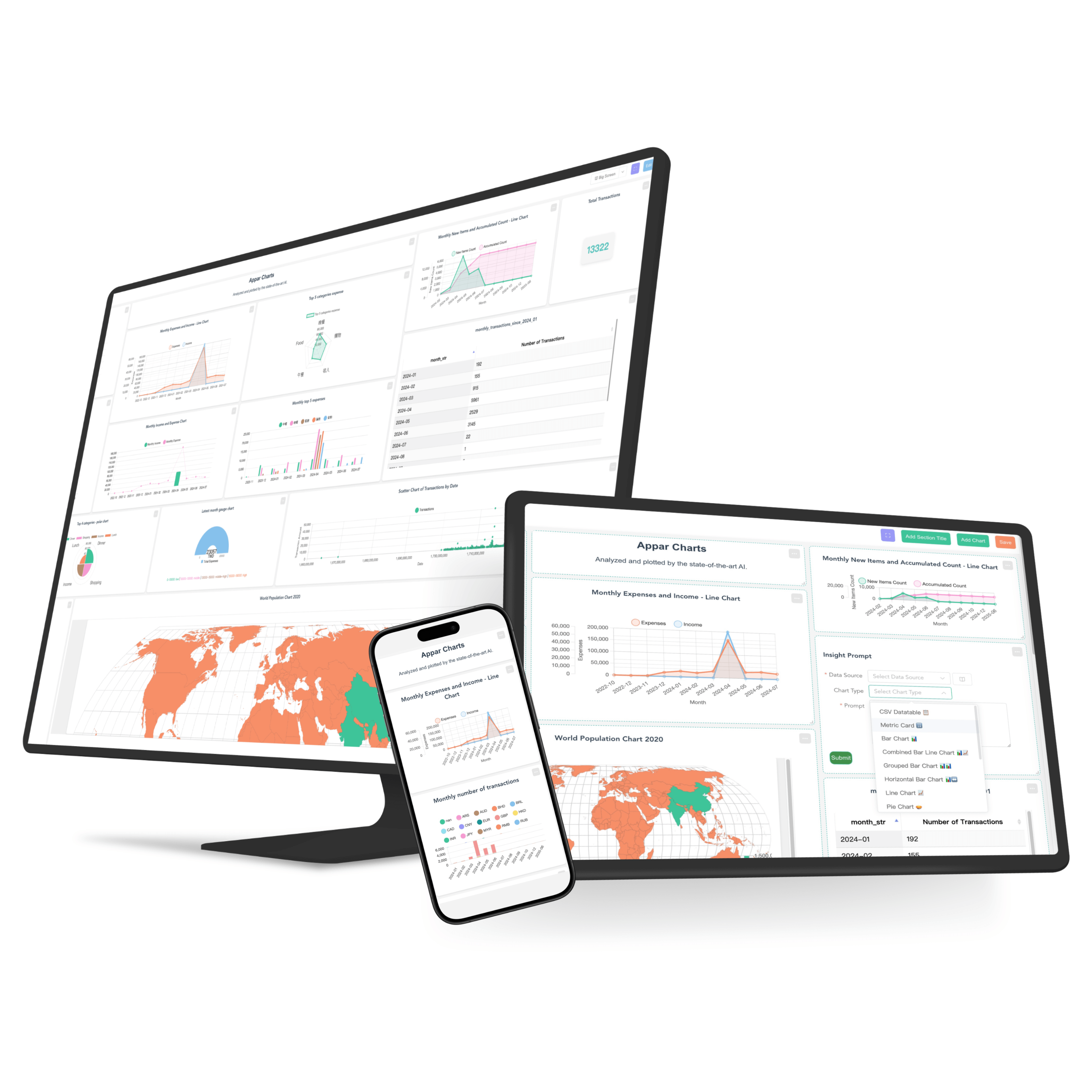
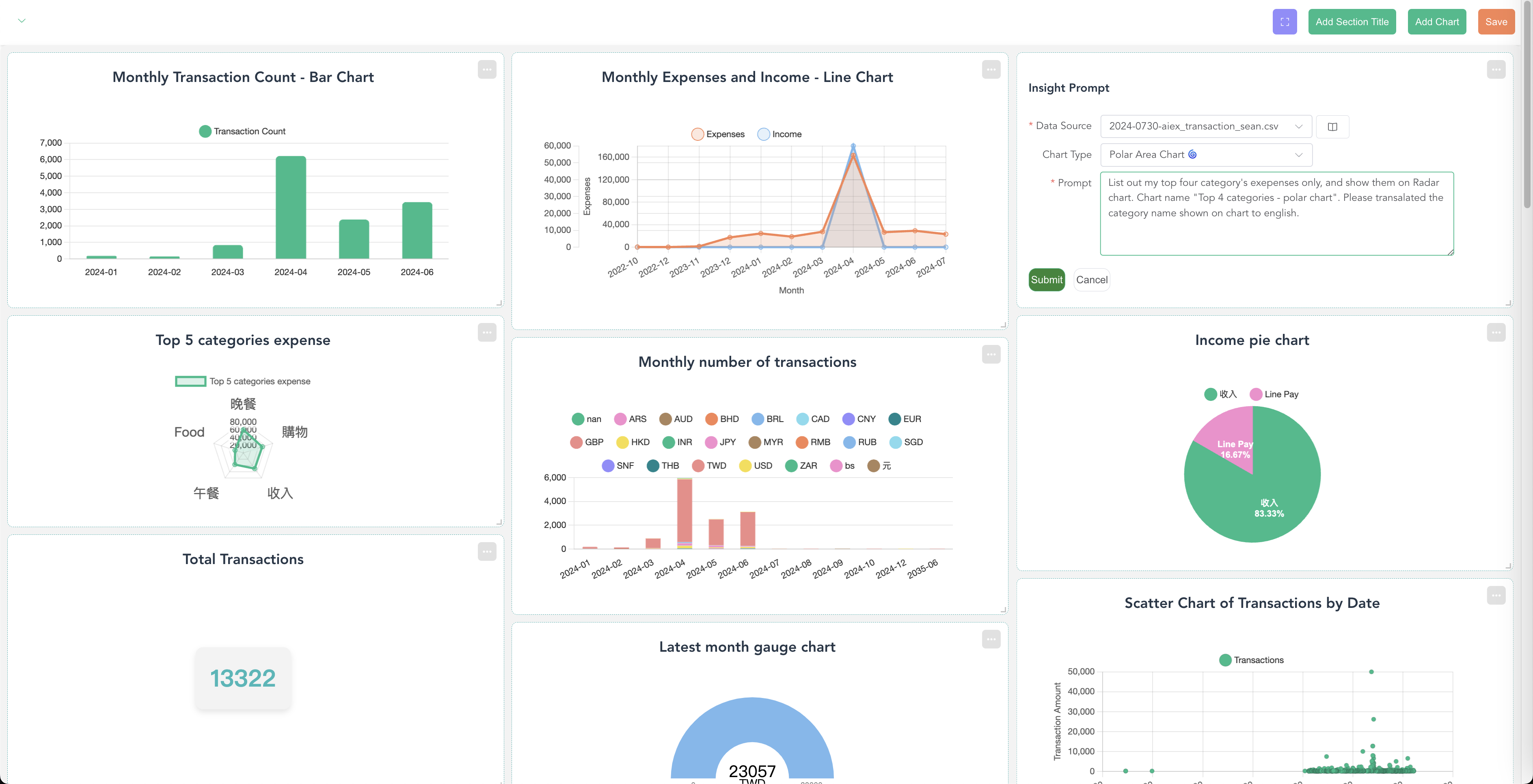
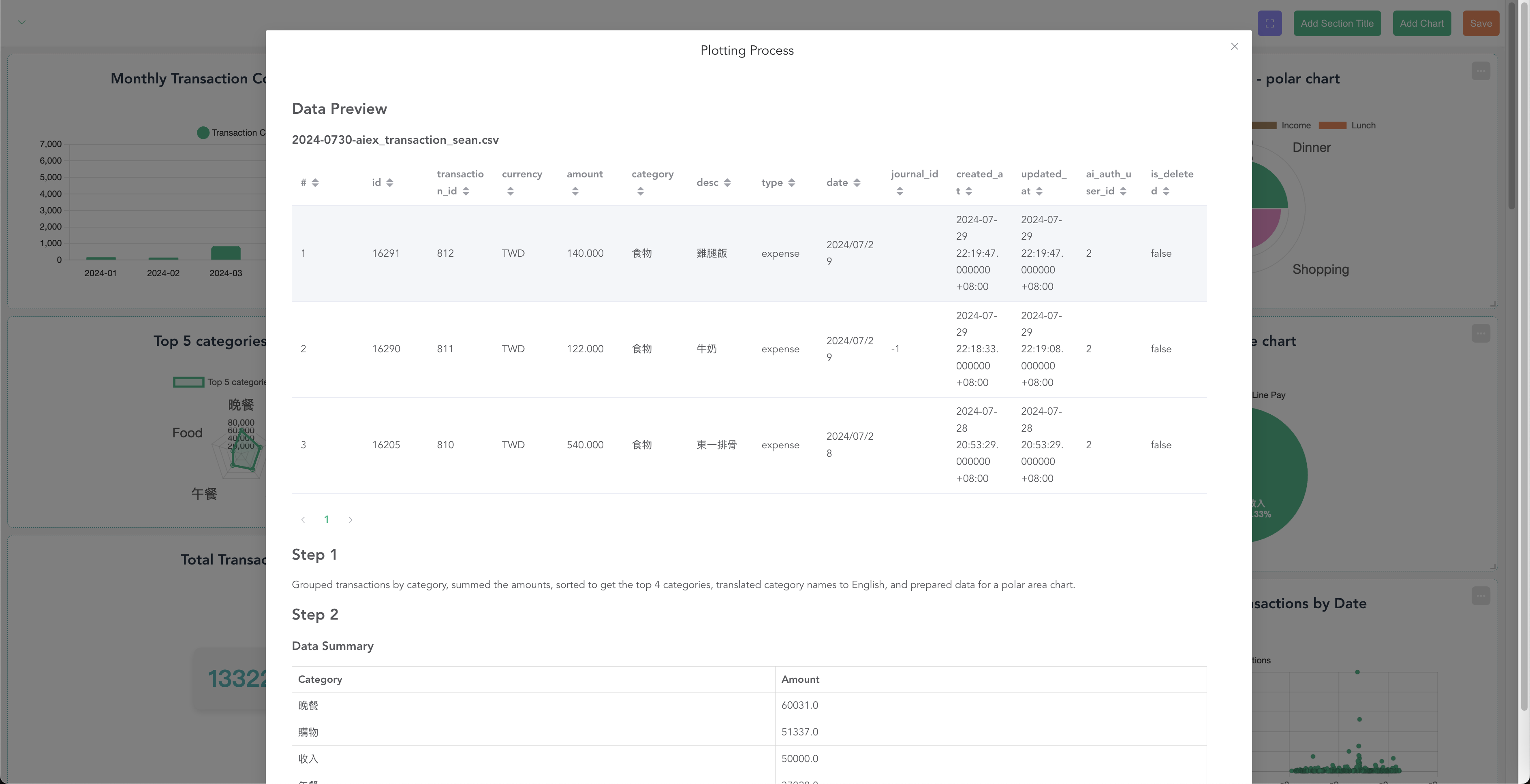
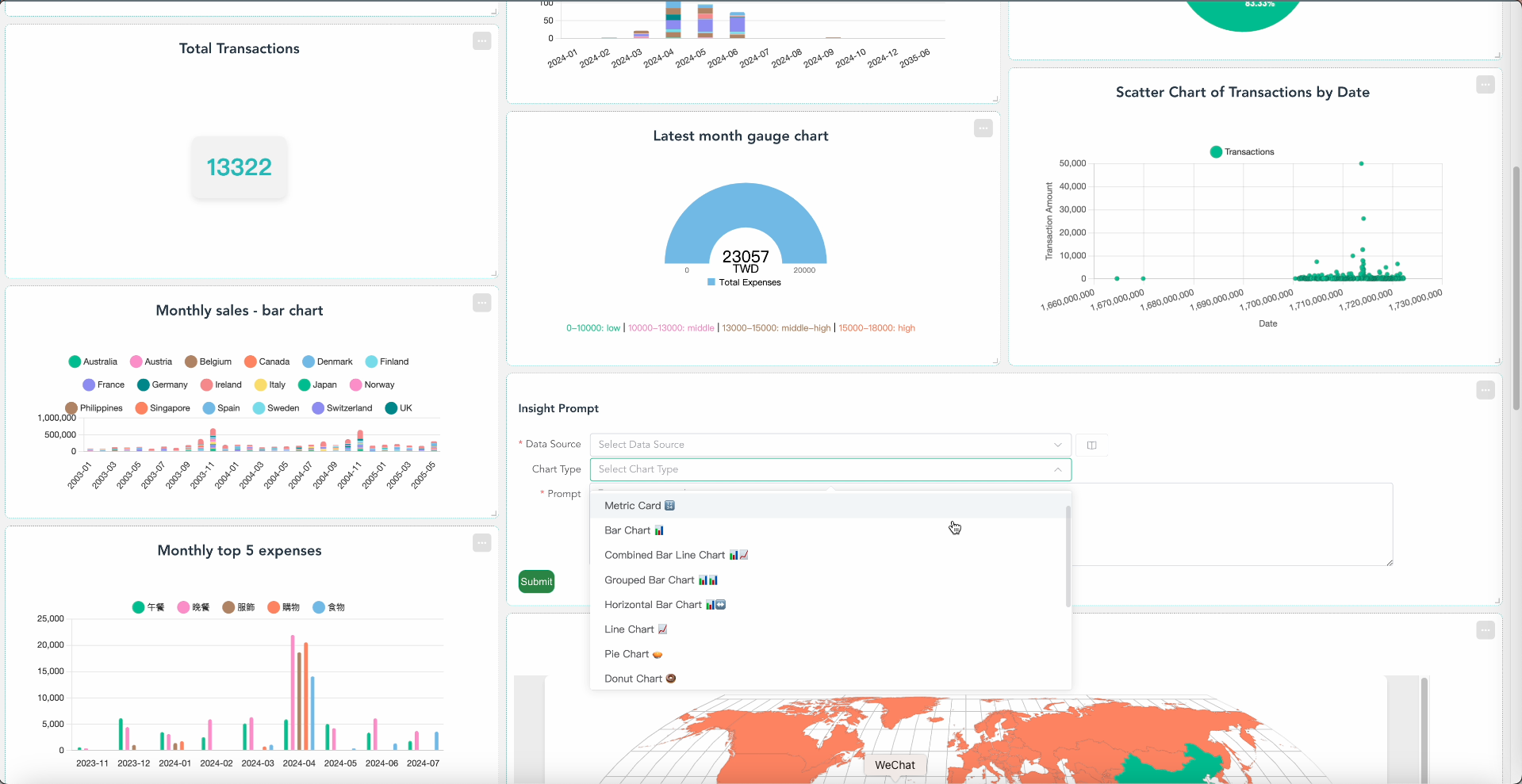
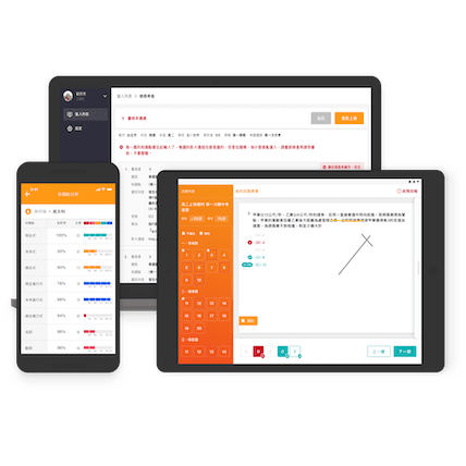
Visualizations like bar charts, pie charts, and line graphs can make data come alive, transforming it into compelling presentations and informed decisions. However, creating these charts often requires a solid understanding of data analysis and familiarity with tools like Excel, PowerBI, or Tableau. Appar AI’s online dashboard removes these complexities. Simply upload your data or connect to your database, ask your questions, and instantly generate the charts you need! This seamless experience is designed to make data visualization accessible to everyone, enhancing your insights and decision-making without the hassle of complicated interfaces.
PROBLEM
Using various online chart-making tools for data analysis requires first understanding the different parameter names on the interface and clarifying which chart parameters correspond to which parts of the chart. Additionally, different types of charts require different parameter settings and data table columns. So, is making charts really that complicated? After spending a lot of time, you finally painstakingly create a few charts that can be used in a presentation.
CLIENT
As a brand manager, you want to see monthly order volumes and shipment trends;
As you prepare for a weekly report with senior management, you're organizing a large amount of production and cost data to create charts;
As a product manager, you're planning which database data to convert into charts for stakeholder reports;
As a business leader, you want to create a war room dashboard to guide your team in a unified direction.
The charts and online dashboards you need can all be created through AI.
KEY FEATURE
4-step simplicity
Key attributes
Including Traditional Chinese, Simplified Chinese, English, French, and more...
APPAR COVERED
RESULT
In an era advocating digital transformation, Appar Technologies' Appar AI dashboard tool enables individuals and businesses to have secure, personalized, and cutting-edge customized dashboards. Appar Technologies lowers the learning curve for individual users in creating chart tools, making chart creation simpler and clearer without the hassle of complex interfaces. For businesses, adopting this dashboard product significantly reduces the time and cost of developing dashboards, allowing key charts to be dynamically edited according to different performance indicators each quarter or year, thus maintaining the highest level of industry competitiveness.
TECHNOLOGIES


WORK DETAILS
YOU MIGHT LIKE


CONTACT US
Let's talk about your ideas!
Jump-start your business with your innovated digital partner. We will reply within one business day. (GMT+8)


